MOVIE THEATER • Snack Ordering App
Aplication designed to assist frequent moviegoers in metropolitan areas. Its
primary purpose is to facilitate snack ordering within movie theatres. As a user, you can
conveniently order food directly from your seat or choose to pick it up from the counter.
Our target customers are individuals aged between 20-60 years old who lead busy lives (such as
parents, working students, etc.) but still enjoy the opportunity to unwind and indulge in snacks
while at the movie theatre.
- Duration: December 2021
- Role: UX/UI Designer
- The Problem: For this project, I applied lots of user experience methodologies, between wich I interviewed users and I created empathy maps to understand users' needs for a cinema. Throughout the research, I noticed additional needs compared to when I initially started the project. For example, including individuals with different dietary requirements, intolerancies and allergies in the interviews provided me with a new perspective on their needs while buying snacks at a cinema. My initial assumption, confirmed by the research, was that users prefer using digital platforms to order from their seats to avoid long queues when ordering food. However, I also discovered that cost, accessibility, and having a single app are additional pain points that require solutions.
- The Assignment: Design a snack ordering app for a cinema.
- Responsibilities: Desk research • Conduct interviews • Paper and digital wireframing • Low and high-fidelity prototyping • Conduct usability studies • Iteration based on feedback • Accessibility and iteration of designs.
-
Pain Points:
- Food ordering platforms often do not cater to individuals with allergies. Users may have diverse diets, and sometimes they struggle to find suitable options in food apps.
- Users are too busy to spend time in long queues when ordering food.
- Snacks are usually expensive in these types of apps. Users want to pay a similar price to what they would find in supermarkets.
- Users prefer to have an all-in-one app for food ordering, ticket purchasing, and seat reservations.
-
Software:
- Adobe InDesign • Figma • Microsoft PowerPoint
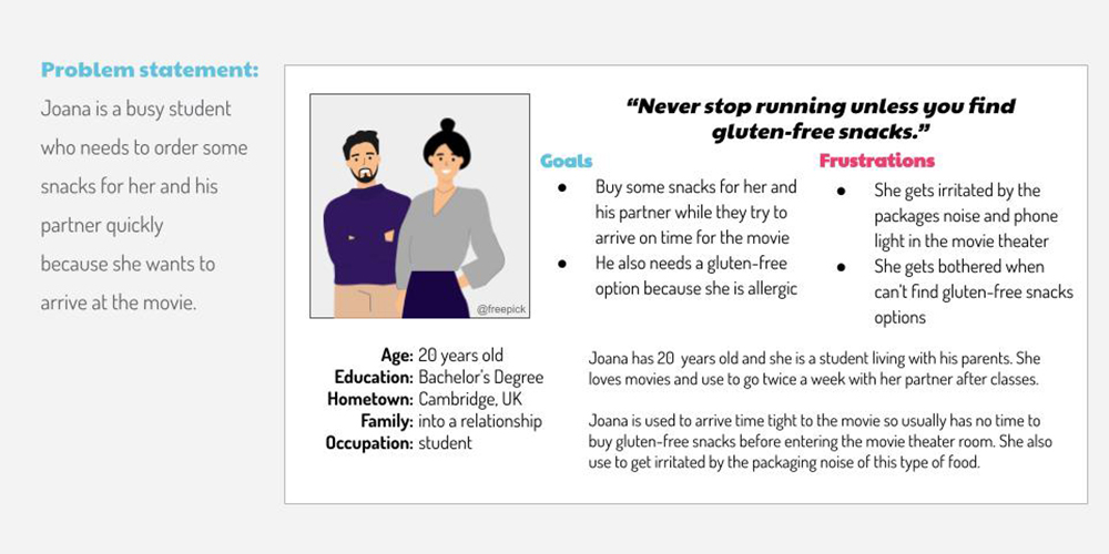
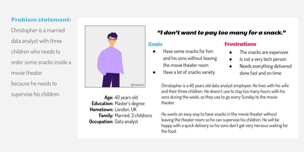
User Persona
User personas are representations of human profiles based on archetypal descriptions derived from research. They are valuable in humanizing design focus, testing scenarios, and fostering empathy with real users.
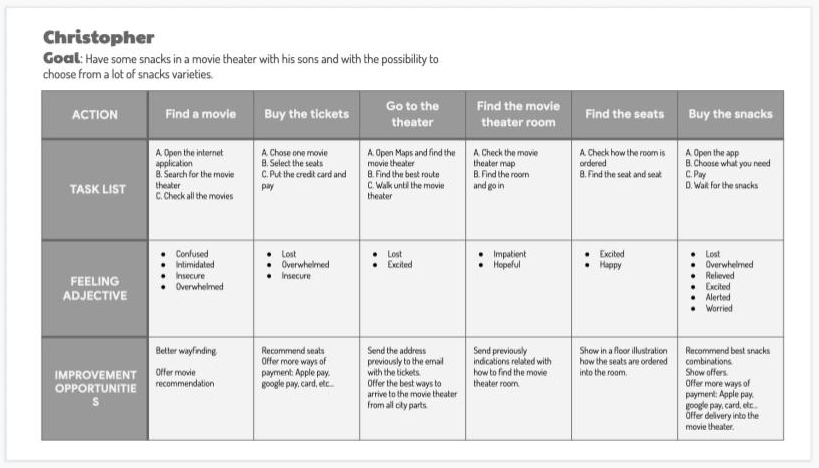
User Journey Map
Mapping Christopher's user journey highlighted the benefit of integrating ticket purchasing and
snack ordering within the main Movie Theatre app. It also revealed the potential effectiveness of
sending app offers to our users.
Mapping Joana helped me understand various user needs, such as food allergies and intolerances. It
shed light on how her busy schedule impacts her day-to-day activities.
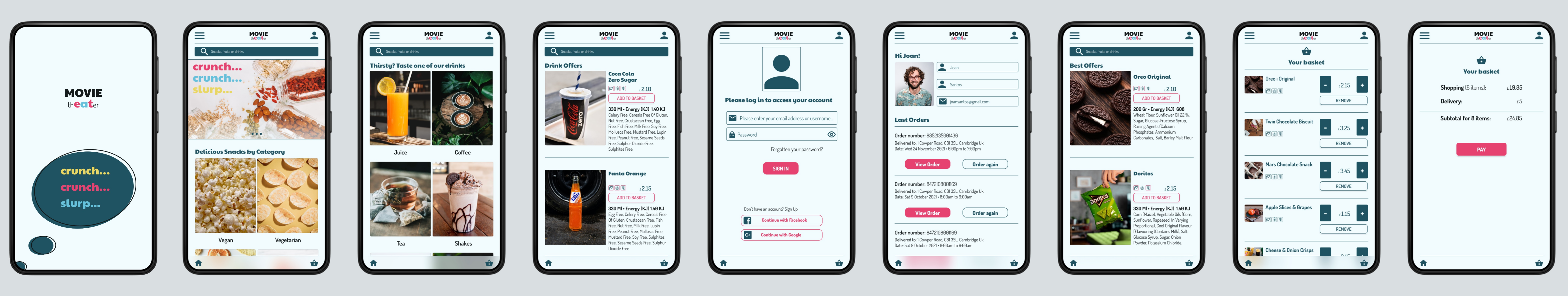
Wireframes
To address users' pain points effectively, I began by designing a solution using pencil and paper. This approach allowed for quick iteration and exploration of various ideas in a cost-effective manner. Once I finalized the screen designs, I proceeded to create digital wireframes. You can see examples of both paper wireframes and digital wireframes below.
I have also created a low-fidelity prototype based on the digital wireframes. This prototype allows users to order snacks at a movie theater. Please follow the link below to access the low-fidelity prototype.
Usability Study: Findings
I conducted two rounds of usability studies. The findings from the first study guided the transition from wireframes to mockups. The second study, which utilized a high-fidelity prototype, identified areas in the mockups that required refinement.
- Users require more payment options during the checkout process.
- Users prefer a quick and streamlined checkout method.
- Users want to be able to view their past orders in their profile.
- Motion needs further refinement to enhance the user experience.
- The checkout process has too many unnecessary steps.
- Buttons are overlapping with some text.
High Fidelity Prototype
Finally, after numerous iterations, I created the final mockup, which allowed me to deliver the high-fidelity prototype. Please click the button below to interact with the high-fidelity prototype.
Takeaways
Impact:
The app allows users to find the snacks they need at the right moment when at a
movie theater. This snack ordering app is an amazing solution for parents who go to the movie theater
with their children.
What I learned:
While designing the Movie Theater app, I didn't anticipate the many
considerations and pains in the user journey. Iteration was key in approaching and solving the
challenges in this project.
Next Steps
- In this project, I focused on creating the snack ordering process, but users also want to buy tickets and reserve seats within the app. This can be a future feature for the project.
- Users also wanted to add more payment options.
- Create the missing screens.
- Improve app accessibility and compatibility with screen reading apps.
- Iterate on the design based on user feedback after the launch.
Please follow the links below to access the high-fidelity prototype and the documentation of this project.