UOC • University App for Building Community
This project focuses on addressing the challenges faced by remote universities and the need for individuals working and studying there to establish a sense of community. It was undertaken as part of my information architecture subject for the master's degree in UX Design at the Open University of Catalonia.
- Duration: 4 months
- Role: In this project, I served as an Information Architect. An information architect is responsible for organizing all the information in a product or website in a user-friendly manner.
- The Problem: The Open University of Catalonya (Universitat Oberta de Catalunia - UOC), founded in 1995, was the world's first 100% online university. One of its biggest challenges is to adapt to the diverse profiles of students who choose distance education. Another challenge is to effectively meet the educational needs of individuals pursuing lifelong learning in various circumstances and contexts. The UOC aims to create a community by encouraging the sharing of experiences and perspectives to facilitate exchange and growth.
- The Assignment: Develop an app for the Open University of Catalonia that facilitates and connects professors and students engaging in distance education, fostering a sense of community.
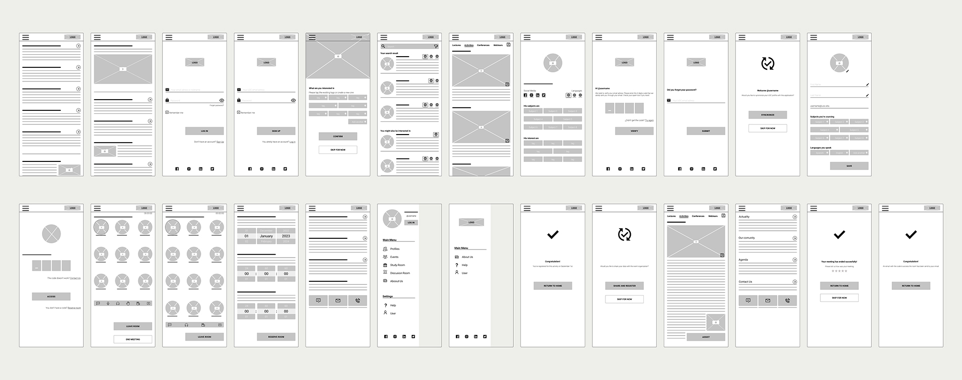
- Responsibilities: Creating scenarios, designing user journey maps, defining initial functional requirements and design parameters, designing the content inventory, conducting monitored card sorting, designing the navigation tree and user flow, sketching, wireframing, and prototyping.
-
Pain Point:
- Students require a means of communication to foster a sense of community.
- Professors are eager to assist students with resources, but they need to know the languages their students understand in order to do so.
- Users (professors and students) want to stay informed about UOC events and those organized by other institutions, and be able to register for them through the app.
- As an international university, users need to know the languages spoken by others when discussing the university, resources, or events.
- Users require a private space where they can hold personal virtual meetings.
-
Software
Adobe Indesign • Optimal Workshop • Figma
Solution
The solution I developed for this project focuses on building a community by enabling students to connect with each other and addressing their needs. In this app, users can engage in virtual study sessions using the "Study With Me" method. They can also view the subjects other users are studying, the languages they speak and understand, and recommend resources to each other. The proposed solution allows users to access and register for events, both virtual and in-person. Additionally, students and professors can schedule private virtual meetings through the app.
Methodology
In the initial phase of the project, I created scenarios and a user journey map to empathize with the users and understand their needs. Based on the insights gained from this phase, I identified the information requirements for the platform and created a content inventory. I conducted monitored card sorting using Optimal Workshop, where I supervised users and encouraged them to think aloud, allowing me to gather additional insights. Subsequently, I worked on the navigation tree and user flow, which informed the creation of a low-fidelity prototype.
Scenarios
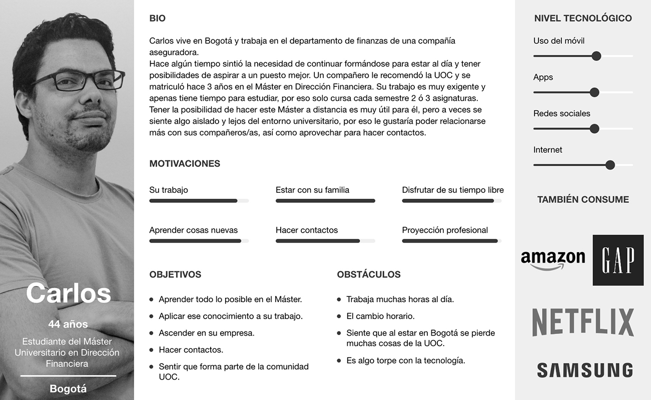
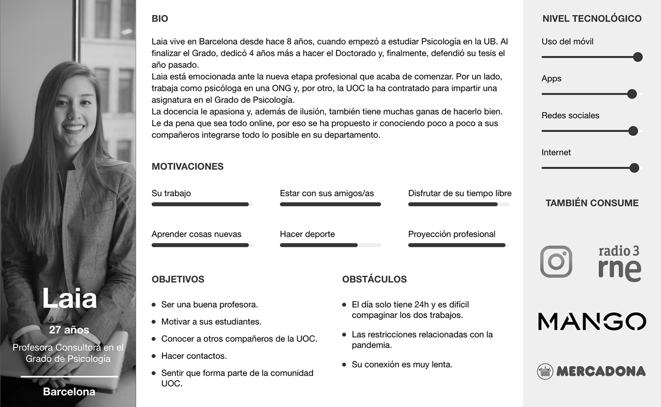
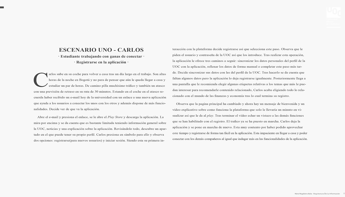
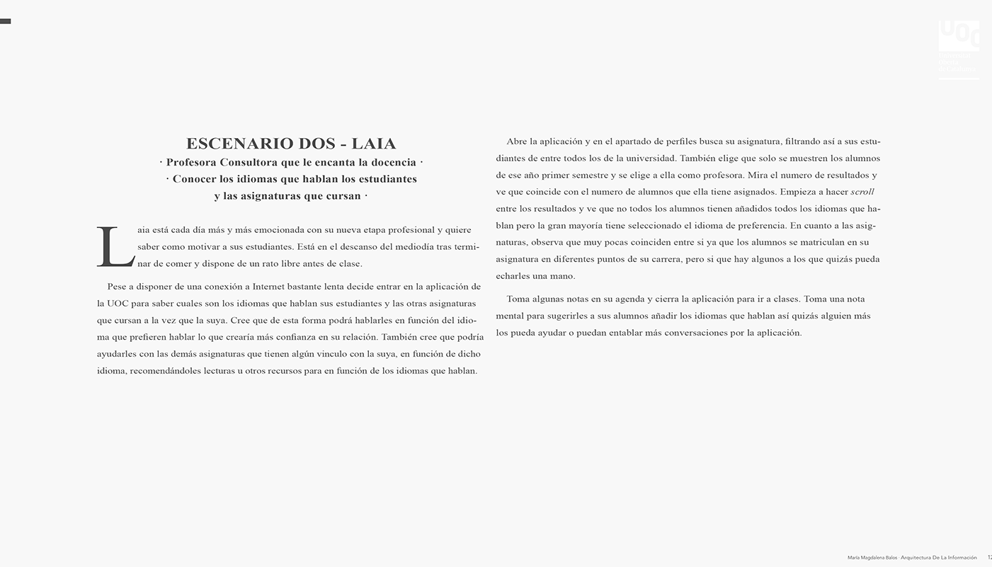
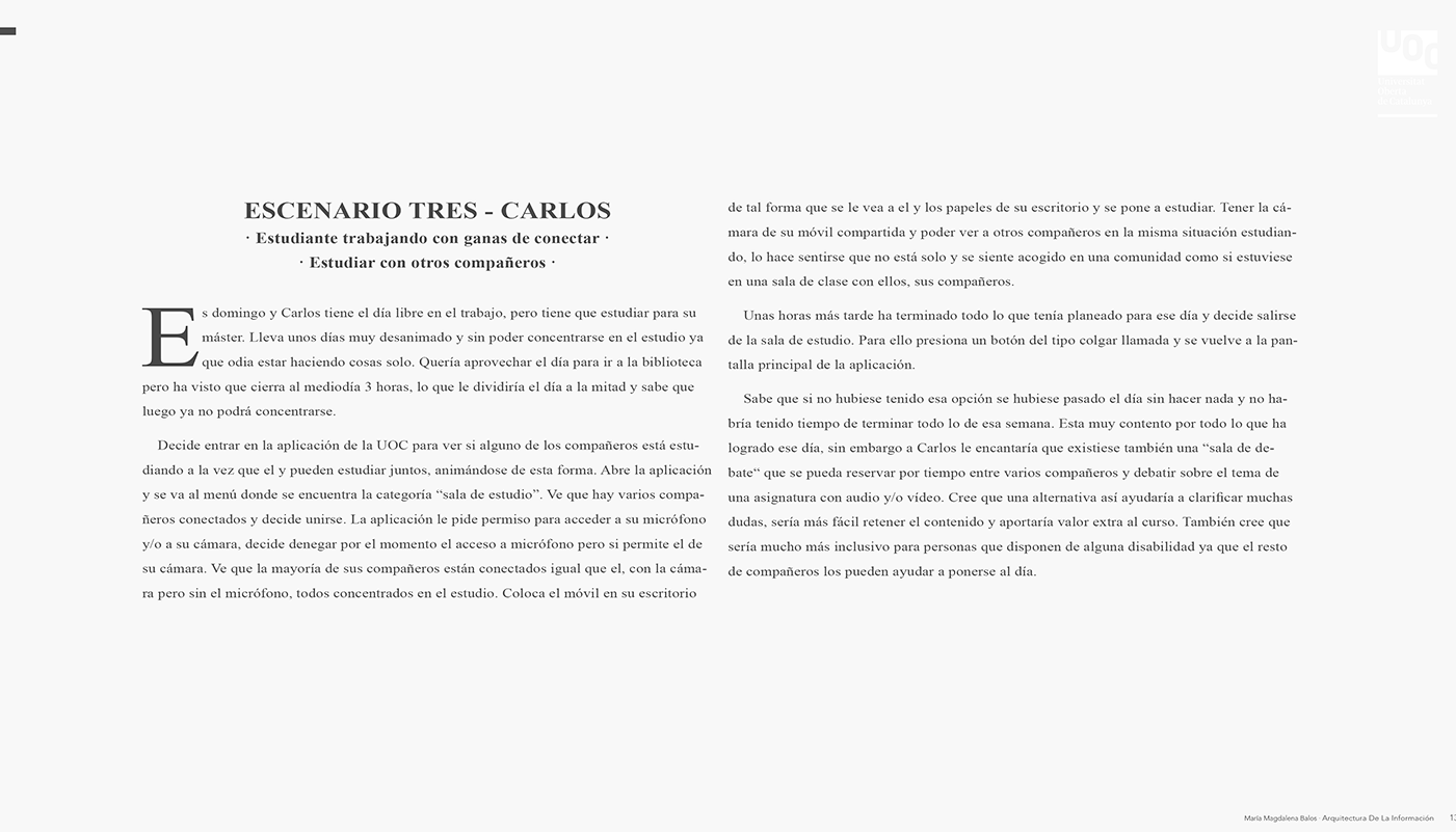
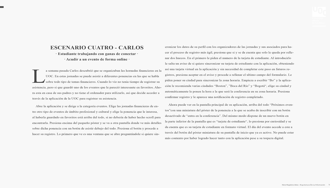
Scenarios are employed in various situations, but in this case, I utilized them during the ideation phase to craft concise narratives about users utilizing my product to accomplish specific tasks. These scenarios offer valuable context and a shared understanding, aiding me in generating design solutions.
User Journey Maps
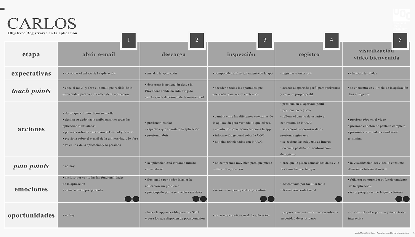
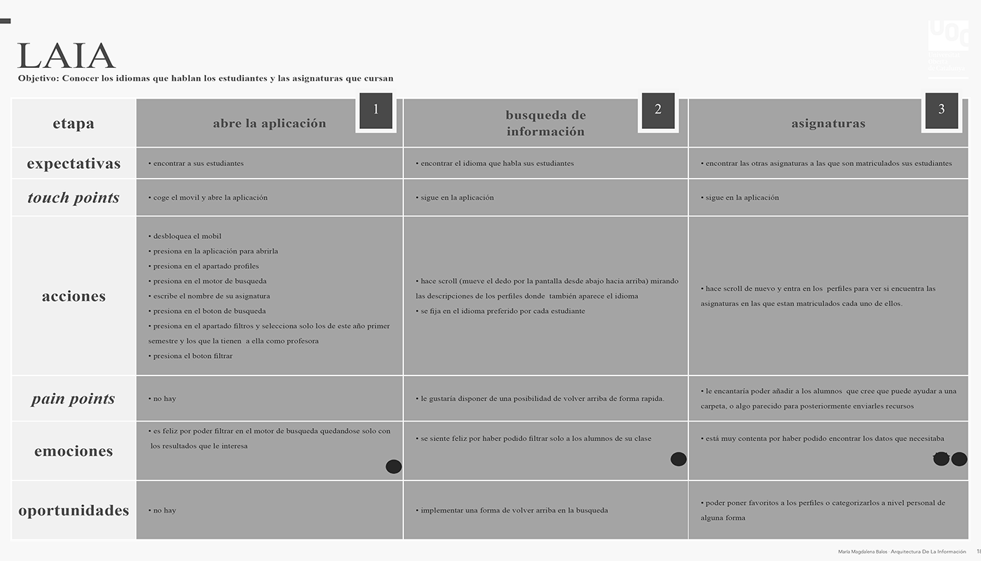
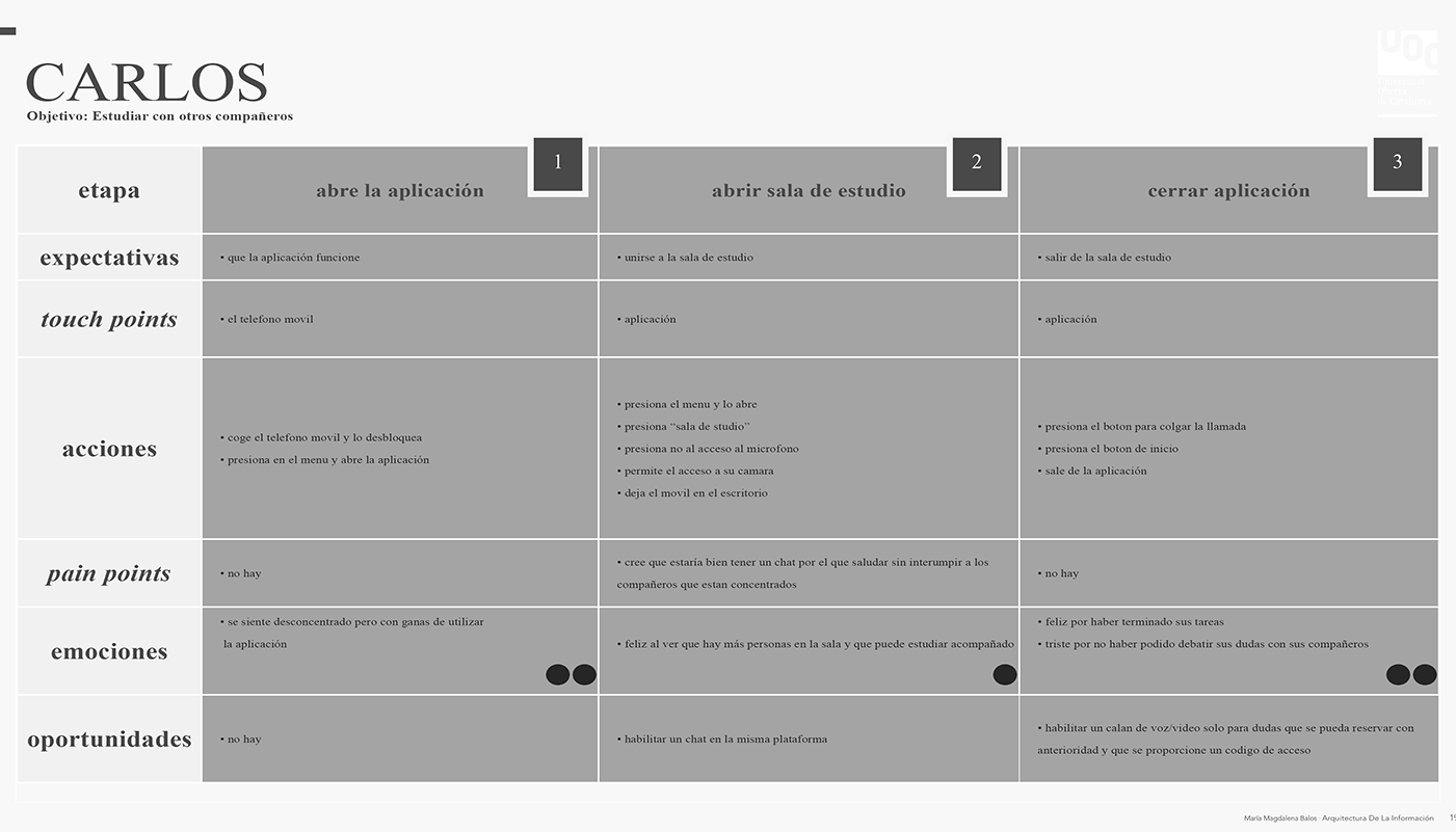
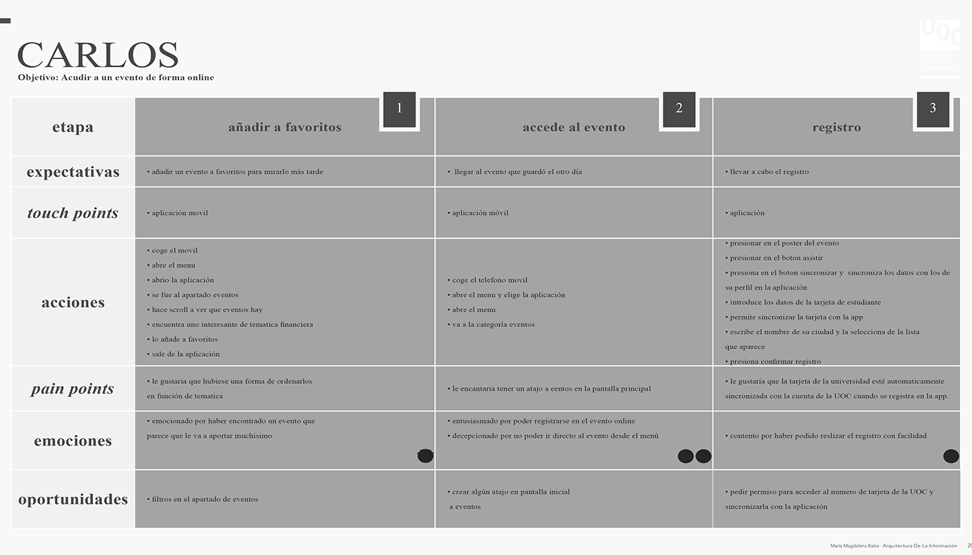
The User Journey Map, a visual representation of the user's interactions and experiences with the product, played a crucial role in identifying and strategizing the key moments throughout their journey. It provided valuable insights into their needs, emotions, and pain points, allowing me to design a more intuitive and satisfying user experience.
Monitored Card Sorting
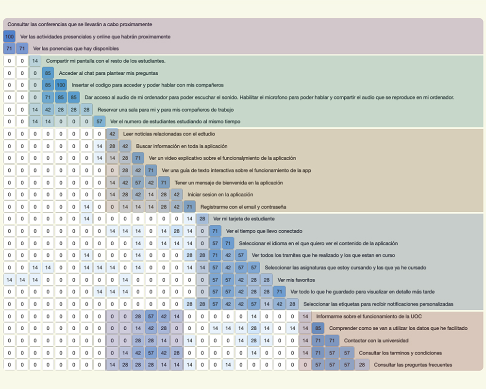
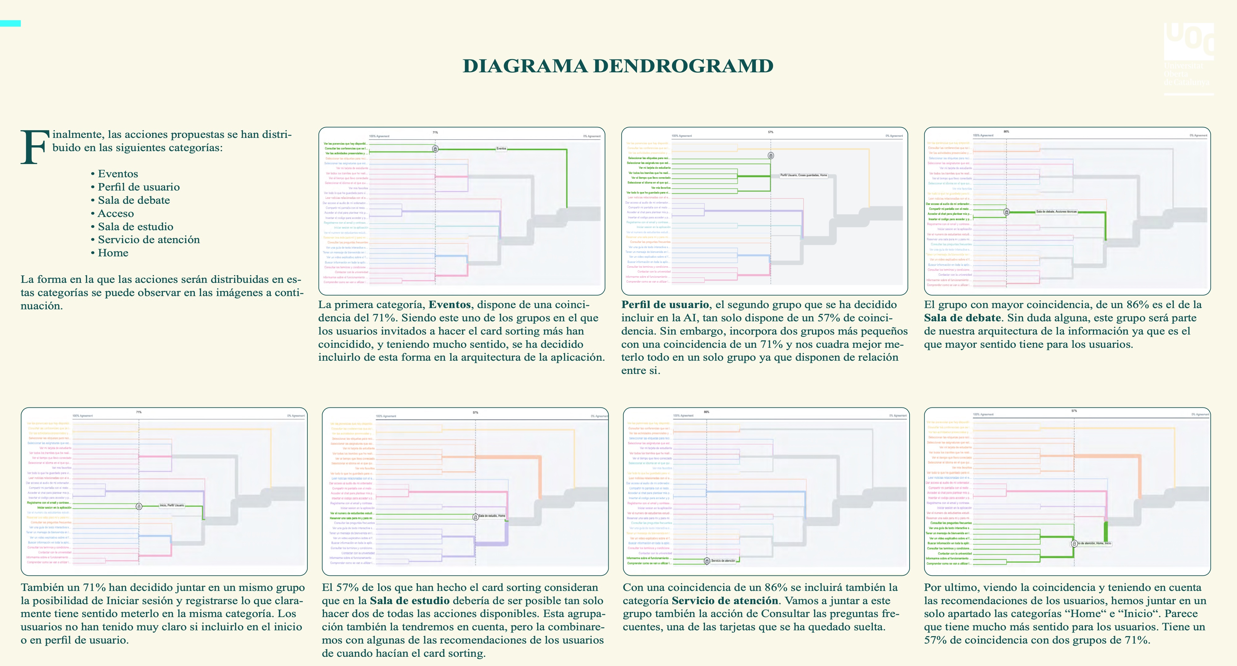
Card sorting is a research technique used to understand how people perceive and organize information. In this project, I opted for a monitored hybrid card sorting approach. During this research process, users were given a set of cards and asked to categorize them based on their own understanding. They were also given the flexibility to create new cards if they felt it was necessary. By closely monitoring this process, valuable insights were gathered to inform the information architecture and organization of the product.
Navigation Tree
The navigation tree was instrumental in assessing the structure of the UOC app and determining the ease with which users can locate items within it. By utilizing the navigation tree, I gained valuable insights into the organization and hierarchy of the app's content, ensuring an intuitive and user-friendly navigation experience.
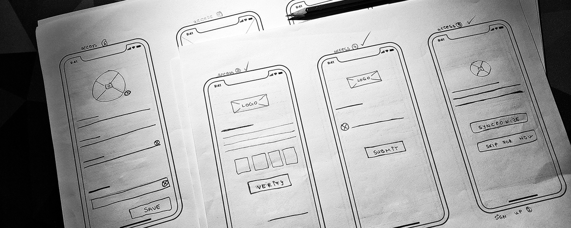
Paper Wireframing
Paper wireframing involves creating basic outlines of a digital experience, such as an app or a website. There are several compelling reasons to utilize paper wireframes, including their speed, cost-effectiveness, and ability to facilitate idea exploration and focus. In the context of this project, I developed 21 distinct paper screens to illustrate user interactions and demonstrate the functionality of the platform.
Next Steps
While this information architecture project has reached its current stage, there are several further steps to consider in the process:
- Create the remaining screens to ensure users can successfully complete all procedures within the application.
- Conduct a usability test with users, carefully observing and documenting their behaviors and reactions during interactions with the product.
- Iterate on the wireframes, incorporating insights gained from the low-fidelity usability study.
- Develop mockups to visualize the final look and feel of the product.
- Create a high-fidelity prototype based on the mockups.
- Conduct a usability test using the high-fidelity prototype.
- Generate final documentation summarizing the project's processes, insights, and outcomes.
Please follow the links below to access the prototype. This project was part of my Master's Degree at the Open University of Catalonia in Barcelona, Spain. Consequently, all the documentation is in Spanish. I apologize for any inconvenience caused.
